More of Our Work
Recent Projects
The Brief
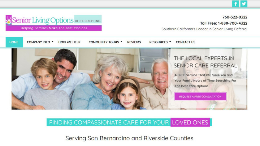
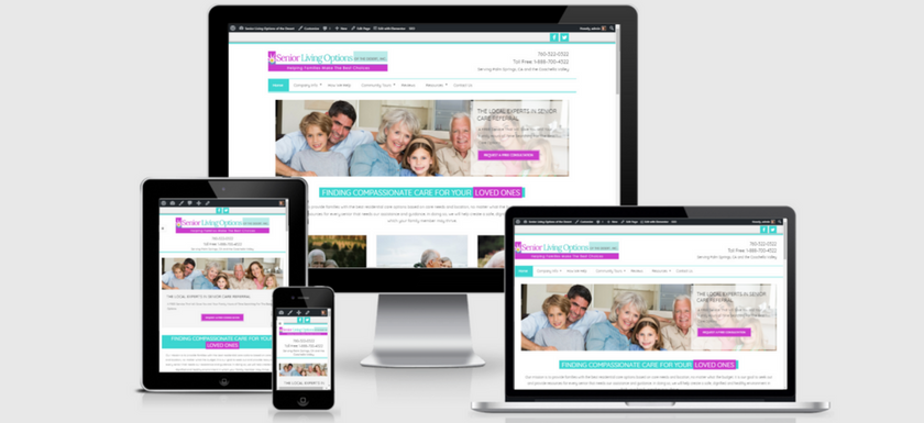
A local senior living referral agency was paying a lot of money each month on advertising to drive traffic to their website. They wanted a website that was SEO optimized and would show up more in organic search results. They also wanted to be known as the local experts as their main competitor has a national presence.
Our Approach
We researched their competitors to determine what they were doing that was working well. We also analyzed the content on their current website to see if it was addressing the needs of their ideal client.
We focused on content that would better engage their visitors and be optimized for search engines.
The Result
The overall website design was modern, fresh and engaging. And, it’s designed to get visitors to take action.
The Brief
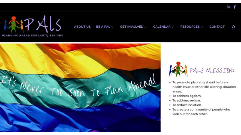
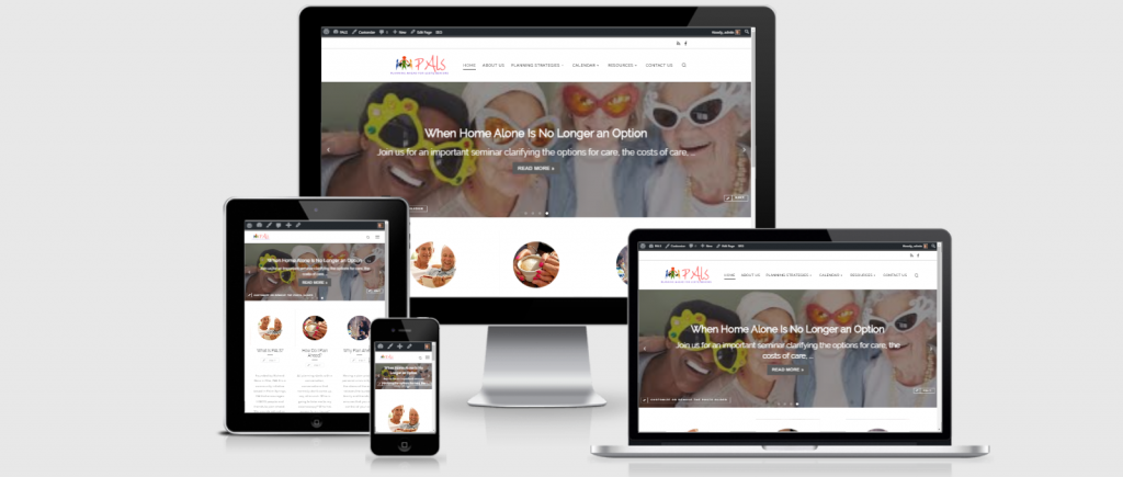
PALS (Planning Ahead for LGBTQ Seniors) is a local grass roots organization that focuses on helping LGBT seniors plan ahead for their long-term care. They did not have a website but wanted to build one so they could get information out about their seminars, socials and other events. And, they wanted to start building an online community for others to connect.
The Approach
We worked with the Steering Committee to understand the mission of PALS and what visitors to the site would be looking for. We translated that into a fun, engaging site that provided information and encouraged visitors to get involved and create a community.
The Result
The website has brought a lot of attention and awareness of what PALS is doing. And, they are building a community of people who are helping each other plan for and care for each other.
The Brief
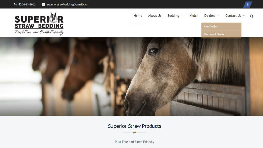
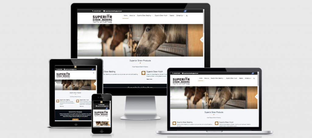
Mike and Stacey Lauwers of Superior Straw Bedding had a basic website with minimal content on it. They were looking for a website that would rival their competitors. They are the first farm in the US to have this specific product and wanted to build a client base.
Our Approach
We worked with Mike & Stacey to understand the benefits of their new product. We researched their competitors (who were in Canada) to see what they were doing, what was working well for them, and what we could do differently.
We focused on content that would highlight the benefits of their product and that would convince visitors that they needed this product. And, since they use a unique, state-of-the-art technology (first of its kind in the U.S), we took video of the process and highlighted that on the home page.
